グリッドに複数選択可能なチェックボックスを追加する
業務でよく使われるグリッド(テーブル)についてはhifiveでも力を入れて取り組んでいます。今回は業務要件でありがちな、行を複数選択する機能について紹介します。
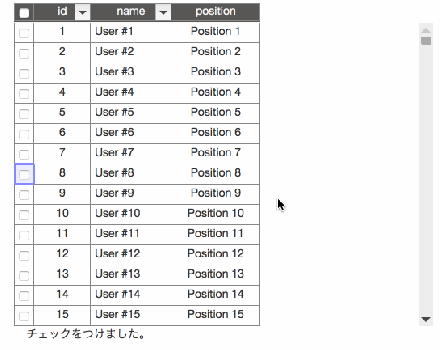
実際に動作している様子は以下の画像になります。
実際の動作はこちらで確認できます。
表示する際の設定
グリッド表示を行うDataGridを初期化する際に二つの変更を行います。まず、カラム表示を追加します。
以下の _selectCheckBox を追加することでカラムが追加されます。
This file contains hidden or bidirectional Unicode text that may be interpreted or compiled differently than what appears below. To review, open the file in an editor that reveals hidden Unicode characters.
Learn more about bidirectional Unicode characters
| mapper: { | |
| type: 'property', | |
| param: { | |
| : | |
| visibleProperties: { | |
| header: ['_selectCheckBox', 'id'], | |
| : | |
| }, | |
| : | |
| } | |
| }, |
次に表示設定を行います。幅は25px、リサイズ不可、値は選択した値としています。チェックボックスを表示する場合は cellFormatter.checkbox(true) を指定します。
This file contains hidden or bidirectional Unicode text that may be interpreted or compiled differently than what appears below. To review, open the file in an editor that reveals hidden Unicode characters.
Learn more about bidirectional Unicode characters
| properties: { | |
| _selectCheckBox: { | |
| size: 25, | |
| enableResize: false, | |
| toValue: function(data, cell) { | |
| return cell.isSelectedData; | |
| }, | |
| formatter: cellFormatter.checkbox(true), | |
| changeHandler: changeHandler.selectData() | |
| }, | |
| : | |
| } |
これで表示側は完了です。
選択した際のイベントについて
次にチェックボックスをクリックした際のイベントについてです。 gridChangeDataSelect が呼ばれます。また、 getSelectedDataIdAll を呼ぶとチェックされたデータが一覧で取得できます。これは値だけが配列で入ってきます。
This file contains hidden or bidirectional Unicode text that may be interpreted or compiled differently than what appears below. To review, open the file in an editor that reveals hidden Unicode characters.
Learn more about bidirectional Unicode characters
| '#grid gridChangeDataSelect': function() { | |
| var selectedDataIds = this._gridController.getSelectedDataIdAll(); | |
| $("#event").text("チェックをつけました。"+selectedDataIds); | |
| }, |
実際の動作はこちらで確認できます。
選択されているデータが取れれば、画面上に表示したり編集などを行うこともできるでしょう。さらなる活用は別な記事で紹介します。
 hifive開発者ブログ
コメントは受け付けていません。