hifiveのデータグリッドライブラリを使いこなす(1)「グリッドの基本形」
今回から何回かに分けて、hifiveのデータグリッドライブラリの使い方を紹介していきます。まず今回は基本形の紹介です。
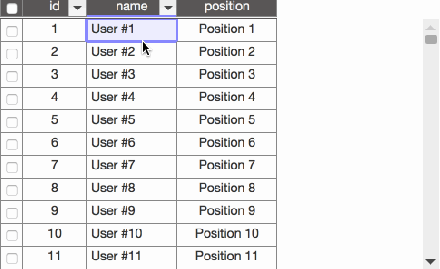
今回のデータグリッドは次のような特徴を持っています。
- ヘッダーが固定表示
- データをスクロールしてもヘッダーは固定
- ヘッダーでソート
- 行を選択するとハイライト
なお、デモはこちらでご覧いただけます。
HTMLについて
今回はデザインにBootstrapを使っています。そのため幾つかのdivタグが追加されています。基本的にはdiv#gridが指定されているだけです。
This file contains hidden or bidirectional Unicode text that may be interpreted or compiled differently than what appears below. To review, open the file in an editor that reveals hidden Unicode characters.
Learn more about bidirectional Unicode characters
| <div class="container"> | |
| <div class="row"> | |
| <div class="col"> | |
| <div class="row"> | |
| <div id="grid" class="col-md-9"></div> | |
| </div> | |
| </div> | |
| </div> | |
| </div> |
CSSについて
グリッドの装飾を幾つか行っています。
This file contains hidden or bidirectional Unicode text that may be interpreted or compiled differently than what appears below. To review, open the file in an editor that reveals hidden Unicode characters.
Learn more about bidirectional Unicode characters
| .grid-content{ | |
| overflow-y: hidden; | |
| margin: 10px; | |
| } | |
| #grid { | |
| height: 300px; | |
| margin: 0 auto; | |
| padding: 0; | |
| } | |
| #grid td { | |
| border: solid 1px #888; | |
| } | |
| #grid .gridSelectedData { | |
| background-color: #1E90FF; | |
| color: white; | |
| } | |
| #grid input[type="checkbox"] { | |
| vertical-align: middle; | |
| } | |
| #grid .gridCell { | |
| text-align: center; | |
| white-space: nowrap; | |
| } | |
| #grid .gridHeaderRow { | |
| background-color: rgb(89, 87, 87); | |
| border-bottom-style: double; | |
| color : whitesmoke; | |
| } | |
| #grid .gridMainBox [data-h5-dyn-grid-property-name="name"] .gridCell { | |
| margin-left: 5px; | |
| text-align: left; | |
| white-space: nowrap; | |
| } | |
| #grid .gridMainBox [data-h5-dyn-grid-property-name="mail"] .gridCell { | |
| margin-left: 5px; | |
| text-align: left; | |
| white-space: nowrap; | |
| } | |
| #grid .gridMainBox [data-h5-dyn-grid-property-name="tel"] .gridCell { | |
| margin-left: 5px; | |
| text-align: left; | |
| white-space: nowrap; | |
| } | |
| .gridCellInfo{ | |
| height: 400px; | |
| border: solid 1px; | |
| overflow-x: auto; | |
| white-space: pre; | |
| } | |
| .gridSortAscIcon > span { | |
| position: absolute; | |
| top: 3px; | |
| left: 13px; | |
| } | |
| .gridSortDescIcon > span { | |
| position: absolute; | |
| top: 3px; | |
| left: 13px; | |
| } |
JavaScriptについて
JavaScriptではまず、幾つかの必要な設定を行います。
This file contains hidden or bidirectional Unicode text that may be interpreted or compiled differently than what appears below. To review, open the file in an editor that reveals hidden Unicode characters.
Learn more about bidirectional Unicode characters
| var datagrid = h5.ui.components.datagrid; |
これらはグリッド表示で使われるハンドラーと、グリッドライブラリ本体です。
初期値について
データグリッドを利用する際には表示の初期設定を行う必要があります。詳しくは別記事で紹介します。
This file contains hidden or bidirectional Unicode text that may be interpreted or compiled differently than what appears below. To review, open the file in an editor that reveals hidden Unicode characters.
Learn more about bidirectional Unicode characters
| var initParam = { | |
| searcher: { | |
| type: 'all' | |
| }, | |
| mapper: { | |
| type: 'property', | |
| param: { | |
| direction: 'vertical', | |
| visibleProperties: { | |
| header: ['id'], | |
| main: ['name', 'position'] | |
| }, | |
| dataDirectionSize: { | |
| size: 25 | |
| } | |
| } | |
| }, | |
| // 表示形式とソートアイコンの設定 | |
| view: { | |
| type: 'table', | |
| param: { | |
| cellClassDefinition: {}, | |
| sortAscIconClasses: ['glyphicon glyphicon-sort-by-alphabet'], | |
| sortDescIconClasses: ['glyphicon glyphicon-sort-by-alphabet-alt'] | |
| } | |
| }, | |
| // 各カラム単位の設定 | |
| properties: { | |
| id: { | |
| size: 70, | |
| sortable: true | |
| }, | |
| name: { | |
| size: 100, | |
| sortable: true | |
| }, | |
| position: { | |
| size: 110 | |
| } | |
| } | |
| }; | |
コントローラの記述
そしてデータグリッドのコントローラ記述です。メタ情報で#gridを指定します。
This file contains hidden or bidirectional Unicode text that may be interpreted or compiled differently than what appears below. To review, open the file in an editor that reveals hidden Unicode characters.
Learn more about bidirectional Unicode characters
| var scrollGridController = { | |
| __name: 'datagrid.sample.ScrollGridController', | |
| __meta: { | |
| _gridController: { | |
| rootElement: '#grid' | |
| } | |
| }, | |
| _gridController: datagrid.GridController, | |
| __ready: function() { | |
| // 初期表示(後述) | |
| }, | |
| }; | |
| $(function() { | |
| h5.core.controller('body', scrollGridController); | |
| }); |
初期表示について
そしてグリッドのデータ表示部分です。今回は簡単なデータ生成を行った後、それをデータソースとしてグリッドに適用しています。
This file contains hidden or bidirectional Unicode text that may be interpreted or compiled differently than what appears below. To review, open the file in an editor that reveals hidden Unicode characters.
Learn more about bidirectional Unicode characters
| __ready: function() { | |
| // サンプルデータ生成 | |
| var ary = []; | |
| for (var i = 1; i < 1000; i++) { | |
| ary.push({ | |
| id: i.toString(), | |
| name: "User #" + i, | |
| position: "Position " + i | |
| }); | |
| }; | |
| var dataSource = datagrid.createDataSource({ | |
| idProperty: 'id', | |
| type: 'local', | |
| param: ary | |
| }); | |
| //データグリッド初期化 | |
| this._gridController.activate(dataSource, initParam); | |
| datagrid.util.delay(1000, this.own(function() { | |
| this._gridController.search({}); | |
| })); | |
| }, |
デモはこちらでご覧いただけます。
これでデータグリッド表示の基本形ができあがりました。次回以降、データグリッドを選択した場合や横スクロール対応などを紹介します。
 hifive開発者ブログ
Trackbacks & Pingbacks
コメントは受け付けていません。