チャートライブラリの使い方(4)「積み上げグラフを作る」
hifiveのチャートグラフの使い方です。今回は チャートライブラリの使い方(2)「データを塗りつぶす」 | hifive開発者ブログ と チャートライブラリの使い方(3)「データを追加する」 | hifive開発者ブログ を組み合わせて積み上げグラフを作ってみたいと思います。
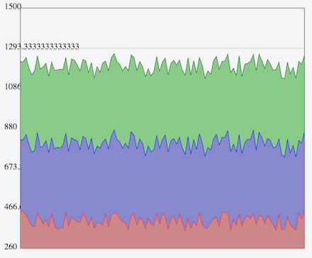
サンプルはこちらになります。表示すると次のようなグラフになります。
系列データを追加する
これは3回の時と同じですが、今回はさらに塗りつぶしの色と値の範囲を指定するようにしました。
This file contains hidden or bidirectional Unicode text that may be interpreted or compiled differently than what appears below. To review, open the file in an editor that reveals hidden Unicode characters.
Learn more about bidirectional Unicode characters
| var series = [ | |
| this._createNewSeries('red', '#c88', 50), | |
| this._createNewSeries('blue', '#88c', 30), | |
| this._createNewSeries('green', '#8c8', 10) | |
| ]; |
それに合わせて系列データを作成する _createNewSeries を変更します。
This file contains hidden or bidirectional Unicode text that may be interpreted or compiled differently than what appears below. To review, open the file in an editor that reveals hidden Unicode characters.
Learn more about bidirectional Unicode characters
| _createNewSeries: function(color, fillcolor, vibration) { | |
| var data = createChartDummyData(400, vibration); // ダミーデータを生成 | |
| // 系列定義 | |
| return { | |
| name: 'series_'+color, | |
| type: 'stacked_line', | |
| data: data, | |
| propNames: { | |
| y: 'val' | |
| }, | |
| fillColor: fillcolor, | |
| color: color | |
| }; | |
| } |
type を stacked_line とすることで積み上げグラフになります。さらにfillColorを指定することで塗りつぶす色が指定できます。
グラフを見ると分かりますが、積み上げグラフを配列で指定した前のデータの上に積み上げられます。これが折れ線グラフ(typeをlineに指定)にした場合にはデータが重なります。
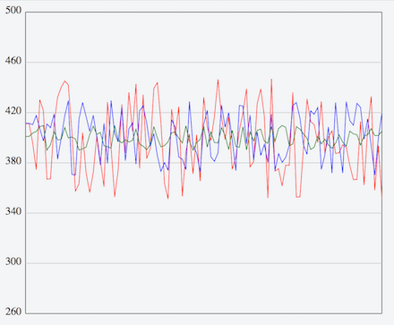
このように折れ線グラフと積み上げグラフを必要に応じて切り替えられるようになっています。
サンプルはこちらにあります。チャートライブラリを使いこなしてユーザビリティの高い業務システムを構築してください。
![]()

コメントは受け付けていません。