カレンダー表示を行うカレンダーコンポーネント(その3)「日付の選択モードを変更する」
カレンダーコンポーネントの使い方、第三弾です。今回はカレンダーの日付選択方式を変更します。
実際に動いているデモはこちらにあります。
使い方
HTMLは次のようになります。選択方式の3パターンを設定できるようにしただけです。
This file contains hidden or bidirectional Unicode text that may be interpreted or compiled differently than what appears below. To review, open the file in an editor that reveals hidden Unicode characters.
Learn more about bidirectional Unicode characters
| <div id="container"></div> | |
| <p> | |
| <input type="radio" class="select" name="select" value="single" /> 一日ごとの選択 <br /> | |
| <input type="radio" class="select" name="select" value="continue" /> 連続選択 <br /> | |
| <input type="radio" class="select" name="select" value="multi" /> 複数日付 <br /> | |
| </p> |
JavaScriptは次のようになります。ラジオボタンの選択した値をそのまま適用しています。
This file contains hidden or bidirectional Unicode text that may be interpreted or compiled differently than what appears below. To review, open the file in an editor that reveals hidden Unicode characters.
Learn more about bidirectional Unicode characters
| $(function(){ | |
| var mainController = { | |
| __name : 'h5.ui.container.MainController', | |
| calendarController: h5.ui.components.Calendar, | |
| __meta : { | |
| calendarController: { | |
| rootElement: '#container' | |
| }, | |
| }, | |
| __init: function(){ | |
| this.$find(".select:first").attr("checked", true); | |
| }, | |
| '.select click': function(context, $el) { | |
| this.calendarController.setSelectMode($el.val()); | |
| }, | |
| }; | |
| h5.core.controller('body', mainController); | |
| }); |
選択モード
選択モードは全部で3つあります。まずデフォルトの1日選択モードです。

次に2回クリックすると、その間の日付をすべて選択状態にするモードです。
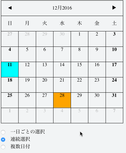
最後に複数の日付を選択できるモードです。

それぞれ必要に応じて使い分けられます。
ホテルや旅行の場合、一気に複数の日付を選択できるのが便利です。複数日付の選択もよく使われる方法です。業務要件に合わせて最適なものを設定してください。
 hifive開発者ブログ
コメントは受け付けていません。