業務システムを作っている中、必要になるのがヘルプドキュメントやマニュアルではないでしょうか。そうしたドキュメントを作る際には画面のスクリーンショットが欠かせません。そして注目して欲しい部分に印をつけたり、他を隠すなど多少の加工が必要です。
今回はそんなスクリーンショットの撮影に加えてちょっとした加工まで行えるソフトウェアを紹介します。
rsms/scrup
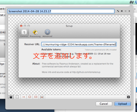
Mac OSX用。スクリーンショットの撮影に加えて、文字や円、四角などのオブジェクトを追加加工できます。そして別途オープンソース・ソフトウェアのサーバへ画像のアップロードまで行えるようになっています。
qscreenshot – Simple creation and editing of screenshots – Google Project Hosting
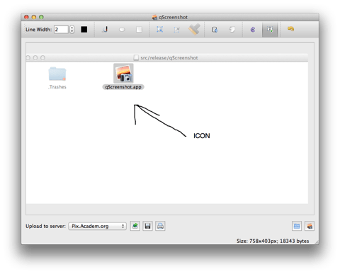
Windows/Mac OSX/Linuxで動作します。デスクトップ全体、ウィンドウ、範囲指定からキャプチャが指定できます。加工や文字の他、フリーハンドでの記入もできます。
chrome-screen-capture – Capture webpage screenshot in Chrome – Google Project Hosting
Google Chrome上で動作します。見えている部分、ページ全体(スクロール含む)、一部のキャプチャが可能で、キャプチャした後にぼかしを加えたり四角や矢印を引いたりできます。
livecapture – Many modes to Capture(Screenshot) – Google Project Hosting
Windows用。デスクトップ全体、ウィンドウ、一部のコントロール、選択したエリア、フリーハンドなど多様なキャプチャができます。矢印やテキストが追加できます。
Free Screen Capture Tool | DuckLink – Design Software
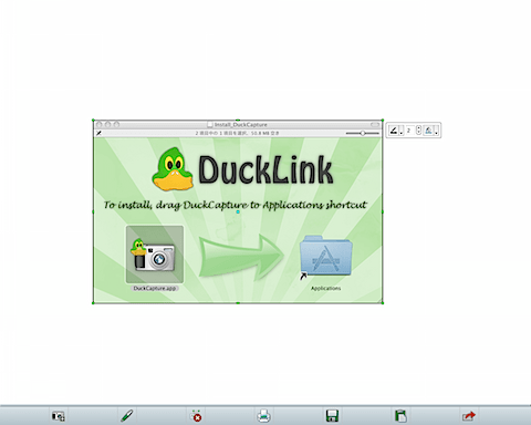
Windows/Mac OSX用。デスクトップ全体や範囲指定、ウィンドウの他にポリゴンという多数の点で自由に囲んでスクリーンショットが撮れます。線や四角、フリーハンドで加工ができます。
Explain and Send Screenshots – Chrome Web Store

Google Chrome用。指定した範囲を画像化し、さらに注釈を書き込んでメールや生成されたURLのシェアができます。
Screenpresso: The Ultimate Screen Capture Tool for Windows
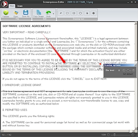
Windows用。スクリーンショットの履歴を保存しており、一覧で管理できます。矢印、ぼかしなどの機能があります。
Windows/Linux用。Java製なのでマルチプラットフォームで動作します。なお、非商用の限り無料なので注意してください。
Screenshot Captor – Software – DonationCoder.com
Windows用。アイコンが用意されていたり、指定範囲外をごかすなどこった画像編集が手軽にできるようになっています。
いかがでしょうか。単純にスクリーンショットを撮るだけのソフトウェアも便利ですが、さらに加工まで行えるとデザイン修正の指摘であったり、ヘルプを作る上でのコントロールへの番号付けなど多くの場面で役立ちます。
業務システム開発に役立ててください!
大量のデータの中からアイテムの選択を容易にする localCombobox を遅延読み込みに対応させる方法を紹介します。
デモはこちらにあります。なお、ベースは hifiveのUIライブラリ紹介「localCombobox」」 を参考にしてください。
動作しているところは次のようになります。

urlオプションを指定する
例えばJSONを返すURLが http://example.com/index.json だったとします。そうした時には ComboBoxController をurlオプションとともに初期化します。
This file contains hidden or bidirectional Unicode text that may be interpreted or compiled differently than what appears below. To review, open the file in an editor that reveals hidden Unicode characters.
Learn more about bidirectional Unicode characters
| this._accountComboBoxController.init({ | |
| url: "http://example.com/index.json" | |
| }); |
これだけでデータを外部から取得して適用するようになります。絞り込みを行う際には元のURL + “value=(入力値)” というリクエストがサーバにきます。サーバ側ではこのリクエストに合わせてデータを絞り込んで返す必要があります。
注意点
JSONデータは次のようなフォーマットになっている必要があります。
This file contains hidden or bidirectional Unicode text that may be interpreted or compiled differently than what appears below. To review, open the file in an editor that reveals hidden Unicode characters.
Learn more about bidirectional Unicode characters
| { | |
| "list":[ | |
| {"value":"0000101"}, | |
| {"value":"0000102"}, | |
| : | |
| {"value":"0000999"} | |
| ] | |
| } |
listというキーを持ち、その中にvalueというキーを持った配列になっている必要があります。
コンボボックスですが、最終的に文字列が値として入ります。つまり表示されている値がフォームにきます。
データの渡し方をカスタマイズしたい場合はAjaxを使って取得する形になるでしょう。Web API側を前述したような形式にできれば、多数の選択肢があるコンボボックスがすぐに実装できます。絞り込みをサーバ側で行った方が良いような、大量のデータがある時に使うと良いでしょう。
業務要件でありがちな、データグリッド上でのデータ編集をhifiveのデータグリッド上でサポートする方法を紹介します。
今回のデモはこちらにあります。動作しているところは次の画像の通りです。
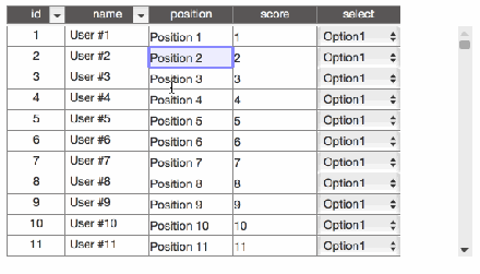
ベースとしてhifiveのデータグリッドライブラリを使いこなす(1)「グリッドの基本形」のグリッドを使います。
データを編集可能にする
グリッドを編集できる状態にするのは簡単です。初期化する際のパラメータで、 properties以下を変更します。例えば次のようにします。
This file contains hidden or bidirectional Unicode text that may be interpreted or compiled differently than what appears below. To review, open the file in an editor that reveals hidden Unicode characters.
Learn more about bidirectional Unicode characters
| properties: { | |
| id: { | |
| size: 70, | |
| sortable: true | |
| }, | |
| name: { | |
| size: 100, | |
| sortable: true | |
| }, | |
| position: { | |
| formatter: cellFormatter.input('text'), | |
| changeHandler: changeHandler.edit() | |
| }, | |
| score: { | |
| formatter: cellFormatter.input('text'), | |
| changeHandler: changeHandler.edit(parseInt) | |
| }, | |
| select: { | |
| formatter: cellFormatter.select(['Option1', 'Option2', 'Option3']), | |
| changeHandler: changeHandler.edit() | |
| } | |
| } |
この時、最も簡単なテキストフィールドでの入力であれば、
This file contains hidden or bidirectional Unicode text that may be interpreted or compiled differently than what appears below. To review, open the file in an editor that reveals hidden Unicode characters.
Learn more about bidirectional Unicode characters
| position: { | |
| formatter: cellFormatter.input('text'), | |
| changeHandler: changeHandler.edit() | |
| }, |
のようにします。フォーマットとして cellFormatter.input('text') を指定します。そして変更後のハンドラーに対して changeHandler.edit() として変更後の値をそのまま適用します。
入力値の変換
入力値を変更したい場合、例えば数値だけ入力できるようにしたい場合は次のようにします。
This file contains hidden or bidirectional Unicode text that may be interpreted or compiled differently than what appears below. To review, open the file in an editor that reveals hidden Unicode characters.
Learn more about bidirectional Unicode characters
| score: { | |
| formatter: cellFormatter.input('text'), | |
| changeHandler: changeHandler.edit(parseInt) | |
| }, |
changeHandler.edit(parseInt) として、入力値に対してparseIntを適用します。
リストから選択
さらに指定されたリストからしか選べないようにしたい場合は次のようにします。
This file contains hidden or bidirectional Unicode text that may be interpreted or compiled differently than what appears below. To review, open the file in an editor that reveals hidden Unicode characters.
Learn more about bidirectional Unicode characters
| select: { | |
| formatter: cellFormatter.select(['Option1', 'Option2', 'Option3']), | |
| changeHandler: changeHandler.edit() | |
| } |
変更した場所が分かるようにする
さらに変更した際に変更したことが確認できるようにします。これは cellClassDefinition を変更します。
This file contains hidden or bidirectional Unicode text that may be interpreted or compiled differently than what appears below. To review, open the file in an editor that reveals hidden Unicode characters.
Learn more about bidirectional Unicode characters
| view: { | |
| type: 'table', | |
| param: { | |
| cellClassDefinition: { | |
| editedCell: function(cell) { | |
| return cell.editedValue !== cell.originalValue; | |
| } | |
| }, |
このように指定することで変更後とオリジナルの値が変わっている場合、そのセルに対して editedCellというクラスが適用されます。cellには変更したセルのオブジェクトが入ります。後はスタイルシートで、
This file contains hidden or bidirectional Unicode text that may be interpreted or compiled differently than what appears below. To review, open the file in an editor that reveals hidden Unicode characters.
Learn more about bidirectional Unicode characters
| .editedCell { | |
| background-color: #FFA; | |
| } |
としておけば変更後はセルの背景色が黄色くなります。
編集機能を使えばマスター編集のような機能であったり、検索結果をそのまま編集すると言った機能も簡単に実現できます。なお、編集後のデータベース適用については別途実装を行う必要があります。
デモを使ってグリッドの編集機能を試してみてください。
業務システムではデータ件数が膨大な数に上ることが多々あります。そんな時にデータを一気に表示するとデータベースの負荷が高くなったり、DOMレンダリングに時間を要するようになります。
そこで使いたいのが遅延読み込みです。hifiveのグリッドコントローラを使えば遅延読み込みも簡単に実装できます。
今回のデモはこちらにあります。動作しているところは次の画像の通りです。今回はデモなので300件としていますが、これが1万件、100万件となってもスムーズに動作します。
ベースとしてhifiveのデータグリッドライブラリを使いこなす(1)「グリッドの基本形」のグリッドを使います。
ダミーデータの用意
今回はダミーデータを返す関数を用意します。param.type は初期表示の際にsearchを、データを追加読み込みする際にfetchが呼ばれます。本来、この部分はWeb APIを介してデータを取得するところになります。
This file contains hidden or bidirectional Unicode text that may be interpreted or compiled differently than what appears below. To review, open the file in an editor that reveals hidden Unicode characters.
Learn more about bidirectional Unicode characters
| function dumyAjax(param) { | |
| if (param.type === 'search') { | |
| return datagrid.util.delay(500, function() { | |
| return { | |
| fetchLimit: 300, | |
| fetchParam: param.param | |
| }; | |
| }); | |
| } else if (param.type === 'fetch') { | |
| var range = param.range; | |
| var dataArray = []; | |
| for (var i = 0, len = range.length; i < len; i++) { | |
| dataArray.push({ | |
| id: String(i + range.index), | |
| name: "User #" + i, | |
| position: "Position " + i | |
| }); | |
| } | |
| return datagrid.util.delay(500, function() { | |
| return { | |
| dataArray: dataArray | |
| }; | |
| }); | |
| } | |
| } |
初期設定
初期設定を行う変数を変更します。lazy(遅延読み込み)の指定を行います。fetchUnitはデータの取得単位です。
This file contains hidden or bidirectional Unicode text that may be interpreted or compiled differently than what appears below. To review, open the file in an editor that reveals hidden Unicode characters.
Learn more about bidirectional Unicode characters
| var initParam = { | |
| searcher: { | |
| type: 'lazy', | |
| param: { | |
| fetchUnit: 100 | |
| } | |
| }, |
データソースの作成
表示するデータソースを表示する処理部分です。typeをAjaxと指定します。param.ajaxは先ほど提示したデータ取得関数(dumyAjax)を指定しています。また、search/fetch/find/commitの4つのキーを持たせる必要があります。そしてそれぞれrequest/responseの2つのキーを持っています。
This file contains hidden or bidirectional Unicode text that may be interpreted or compiled differently than what appears below. To review, open the file in an editor that reveals hidden Unicode characters.
Learn more about bidirectional Unicode characters
| var dataSource = datagrid.createDataSource({ | |
| idProperty: 'id', | |
| type: 'ajax', | |
| param: { | |
| ajax: dumyAjax, | |
| search: { | |
| request: function(param) { | |
| return { | |
| type: 'search', | |
| param: param | |
| }; | |
| }, | |
| response: function(result) { | |
| return result; | |
| } | |
| }, | |
| fetch: { | |
| request: function(param, range) { | |
| return { | |
| type: 'fetch', | |
| param: param, | |
| range: range | |
| }; | |
| }, | |
| response: function(result) { | |
| return result; | |
| } | |
| }, | |
| find: { | |
| request: $.noop, | |
| response: $.noop | |
| }, | |
| commit: { | |
| request: function(edit) { | |
| return { | |
| type: 'commit', | |
| edit: edit.getReplacedDataSet() | |
| }; | |
| }, | |
| response: $.noop | |
| } | |
| } | |
| }); |
これで作成は完了です。基本的なデータグリッドに対して幾つかのオプションを追加するだけで遅延読み込みに対応させられます。
データ件数が100万件など、膨大になっていてもデータグリッドを使うことでデータが適宜追加されるようになります。大量のデータを処理しなければならない業務フローにぴったりの使い方です。
業務要件でグリッドを使っているとよくあるページネーション対応。大量のデータを表示する際に、20件ずつ表示するようにして欲しいと言った話を聞いたことは多々あるでしょう。
JavaScriptでページネーションを実現するのは面倒ですが、hifiveのグリッドコントローラを使うと容易に実装できます。
こちらにデモがあります。なお、ベースになるコードは hifiveのデータグリッドライブラリを使いこなす(1)「グリッドの基本形」 になります。
実装すると次のようになります。

HTMLの変更
HTMLではページネーションを操作するためのDOMを用意します。例えば今回は次のようになります。
This file contains hidden or bidirectional Unicode text that may be interpreted or compiled differently than what appears below. To review, open the file in an editor that reveals hidden Unicode characters.
Learn more about bidirectional Unicode characters
| <div class="col form-inline"> | |
| <span id="firstPage">≪</span> | |
| <span id="prevPage"><</span> | |
| <input id="currentPage" type="text"> / <span id="totalPages"></span>ページ | |
| <span id="nextPage">></span> | |
| <span id="lastPage">≫</span> | |
| </div> |
初期化パラメータの追加
初期化する際に1ページに何件表示するかの指定を行います。今回は10件表示とします。
This file contains hidden or bidirectional Unicode text that may be interpreted or compiled differently than what appears below. To review, open the file in an editor that reveals hidden Unicode characters.
Learn more about bidirectional Unicode characters
| var initParam = { | |
| searcher: { | |
| type: 'all', | |
| // 以下を追加 | |
| paging: { | |
| enable: true, | |
| pageSize: 10 | |
| } | |
| }, | |
| : |
データサーチャーを用意する
今回は新しくデータサーチャーというプロパティを用意します。これはグリッドコントローラから呼び出せますが、繰り返し使うので取り出しておきます。
This file contains hidden or bidirectional Unicode text that may be interpreted or compiled differently than what appears below. To review, open the file in an editor that reveals hidden Unicode characters.
Learn more about bidirectional Unicode characters
| var scrollGridController = { | |
| __name: 'datagrid.sample.ScrollGridController', | |
| __meta: { | |
| _gridController: { | |
| rootElement: '#grid' | |
| } | |
| }, | |
| _gridController: datagrid.GridController, | |
| _dataSearcher: null, // 追加 | |
| : | |
| __ready: function() { | |
| : | |
| this._gridController.activate(dataSource, initParam); | |
| // 以下を追加 | |
| this._dataSearcher = this._gridController.getDataSearcher(); | |
| : | |
| } |
初期表示処理
グリッドの準備ができたところで現在のページ数やトータルのページ数を表示します。トータルのページ数は this._dataSearcher.getTotalPages() で取得できます。
This file contains hidden or bidirectional Unicode text that may be interpreted or compiled differently than what appears below. To review, open the file in an editor that reveals hidden Unicode characters.
Learn more about bidirectional Unicode characters
| datagrid.util.delay(1000, this.own(function() { | |
| this._gridController.search({}); | |
| // 以下を追加 | |
| var totalPages = this._dataSearcher.getTotalPages(); | |
| this.$find('#totalPages').text(totalPages); | |
| this._updateCurrentPage(); | |
| })); |
ページを切り替える
ページの切り替えは次のように行います。以下は1ページ目への移動です。
This file contains hidden or bidirectional Unicode text that may be interpreted or compiled differently than what appears below. To review, open the file in an editor that reveals hidden Unicode characters.
Learn more about bidirectional Unicode characters
| this._dataSearcher.movePage(1); |
後は各ページネーション移動の際のイベントで上記メソッドを実行します。以下は次のページへの移動処理の場合です。
This file contains hidden or bidirectional Unicode text that may be interpreted or compiled differently than what appears below. To review, open the file in an editor that reveals hidden Unicode characters.
Learn more about bidirectional Unicode characters
| '#nextPage click': function(context, $el) { | |
| context.event.preventDefault(); | |
| var currentPage = this._dataSearcher.getCurrentPage(); | |
| var totalPage = this._dataSearcher.getTotalPages(); | |
| if ((currentPage + 1) <= totalPage) { | |
| this._dataSearcher.movePage(currentPage + 1); | |
| this._updateCurrentPage(); | |
| } | |
| }, |
this._updateCurrentPageはページ番号を表示する処理です。 this._dataSearcher.getCurrentPage() で現在のページ数が表示できます。
This file contains hidden or bidirectional Unicode text that may be interpreted or compiled differently than what appears below. To review, open the file in an editor that reveals hidden Unicode characters.
Learn more about bidirectional Unicode characters
| _updateCurrentPage: function() { | |
| var currentPage = this._dataSearcher.getCurrentPage(); | |
| this.$find('#currentPage').val(currentPage); | |
| } |
ページネーションの処理もhifiveのグリッドコントローラを使えば簡単に実装できます。ぜひデモで確認してください。
業務要件でグリッドを使うことは多々あります。そんな中で出てくる要望の一つにヘッダーの固定化があります。さらにこれが進むと、左側の幾つかのカラムだけは固定表示して欲しいと言われます。特に右側にカラムが伸びていく、横幅の大きいグリッドでそういったニーズが出てきます。
今回はそんな要望にも応えられるhifiveのグリッドの使い方を紹介します。
実装すると次のようになります。
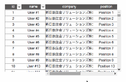
ヘッダープロパティを変更する
今回のベースはhifiveのデータグリッドライブラリを使いこなす(1)「グリッドの基本形」になります。その中にあるvisiblePropertiesを変更します。
元:
This file contains hidden or bidirectional Unicode text that may be interpreted or compiled differently than what appears below. To review, open the file in an editor that reveals hidden Unicode characters.
Learn more about bidirectional Unicode characters
| visibleProperties: { | |
| header: ['id'], | |
| main: ['name', 'position'] | |
| }, |
修正後:
This file contains hidden or bidirectional Unicode text that may be interpreted or compiled differently than what appears below. To review, open the file in an editor that reveals hidden Unicode characters.
Learn more about bidirectional Unicode characters
| visibleProperties: { | |
| header: ['id', 'name'], | |
| main: ['company', 'position', 'zipcode', 'address', 'tel'] | |
| }, |
header(ヘッダー)として id と name を指定しました。これでこの2つのカラムは左側に固定表示となります。残りと main キーで指定されたカラムは表示されますが、スクロール対象となります。
次に各カラムの表示幅を設定します。
This file contains hidden or bidirectional Unicode text that may be interpreted or compiled differently than what appears below. To review, open the file in an editor that reveals hidden Unicode characters.
Learn more about bidirectional Unicode characters
| properties: { | |
| id: { | |
| size: 70, | |
| sortable: true | |
| }, | |
| name: { | |
| size: 100, | |
| sortable: true | |
| }, | |
| /* 以下を追加 */ | |
| position: { | |
| size: 110 | |
| }, | |
| zipcode: { | |
| size: 80 | |
| }, | |
| address: { | |
| size: 110 | |
| }, | |
| tel: { | |
| size: 110 | |
| }, | |
| company: { | |
| size: 200 | |
| } | |
| } |
sizeはピクセル指定になります。表示する情報に応じて調整します。なお、文字がはみ出しても隣のカラムには影響しません(overflow: hiddenになります)。
最後にダミーデータを入れる部分を変更します。これはダミーデータなので本来は不要です。
This file contains hidden or bidirectional Unicode text that may be interpreted or compiled differently than what appears below. To review, open the file in an editor that reveals hidden Unicode characters.
Learn more about bidirectional Unicode characters
| ary.push({ | |
| id: i.toString(), | |
| name: "User #" + i, | |
| position: "Position " + i, | |
| zipcode: "220-8401", | |
| address: "神奈川県横浜市西区みなとみらい三丁目3-1三菱重工横浜ビル13階", | |
| tel: "045-225-5150", | |
| company: "新日鉄住金ソリューションズ株式会社" | |
| }); |
こうすることで、データが詰まったグリッドができあがりました。
左側のヘッダーを固定にして欲しいというニーズはよくあります。スタイルシートとJavaScriptで独自実装もできますが、柔軟に対応するのは難しいでしょう。hifiveのグリッドをぜひ役立ててください。
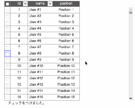
業務でよく使われるグリッド(テーブル)についてはhifiveでも力を入れて取り組んでいます。今回は業務要件でありがちな、行を複数選択する機能について紹介します。
実際に動作している様子は以下の画像になります。
実際の動作はこちらで確認できます。
表示する際の設定
グリッド表示を行うDataGridを初期化する際に二つの変更を行います。まず、カラム表示を追加します。
以下の _selectCheckBox を追加することでカラムが追加されます。
This file contains hidden or bidirectional Unicode text that may be interpreted or compiled differently than what appears below. To review, open the file in an editor that reveals hidden Unicode characters.
Learn more about bidirectional Unicode characters
| mapper: { | |
| type: 'property', | |
| param: { | |
| : | |
| visibleProperties: { | |
| header: ['_selectCheckBox', 'id'], | |
| : | |
| }, | |
| : | |
| } | |
| }, |
次に表示設定を行います。幅は25px、リサイズ不可、値は選択した値としています。チェックボックスを表示する場合は cellFormatter.checkbox(true) を指定します。
This file contains hidden or bidirectional Unicode text that may be interpreted or compiled differently than what appears below. To review, open the file in an editor that reveals hidden Unicode characters.
Learn more about bidirectional Unicode characters
| properties: { | |
| _selectCheckBox: { | |
| size: 25, | |
| enableResize: false, | |
| toValue: function(data, cell) { | |
| return cell.isSelectedData; | |
| }, | |
| formatter: cellFormatter.checkbox(true), | |
| changeHandler: changeHandler.selectData() | |
| }, | |
| : | |
| } |
これで表示側は完了です。
選択した際のイベントについて
次にチェックボックスをクリックした際のイベントについてです。 gridChangeDataSelect が呼ばれます。また、 getSelectedDataIdAll を呼ぶとチェックされたデータが一覧で取得できます。これは値だけが配列で入ってきます。
This file contains hidden or bidirectional Unicode text that may be interpreted or compiled differently than what appears below. To review, open the file in an editor that reveals hidden Unicode characters.
Learn more about bidirectional Unicode characters
| '#grid gridChangeDataSelect': function() { | |
| var selectedDataIds = this._gridController.getSelectedDataIdAll(); | |
| $("#event").text("チェックをつけました。"+selectedDataIds); | |
| }, |
実際の動作はこちらで確認できます。
選択されているデータが取れれば、画面上に表示したり編集などを行うこともできるでしょう。さらなる活用は別な記事で紹介します。
今回から何回かに分けて、hifiveのデータグリッドライブラリの使い方を紹介していきます。まず今回は基本形の紹介です。
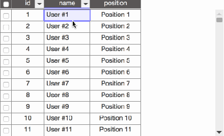
今回のデータグリッドは次のような特徴を持っています。
- ヘッダーが固定表示
- データをスクロールしてもヘッダーは固定
- ヘッダーでソート
- 行を選択するとハイライト
なお、デモはこちらでご覧いただけます。
HTMLについて
今回はデザインにBootstrapを使っています。そのため幾つかのdivタグが追加されています。基本的にはdiv#gridが指定されているだけです。
This file contains hidden or bidirectional Unicode text that may be interpreted or compiled differently than what appears below. To review, open the file in an editor that reveals hidden Unicode characters.
Learn more about bidirectional Unicode characters
| <div class="container"> | |
| <div class="row"> | |
| <div class="col"> | |
| <div class="row"> | |
| <div id="grid" class="col-md-9"></div> | |
| </div> | |
| </div> | |
| </div> | |
| </div> |
CSSについて
グリッドの装飾を幾つか行っています。
This file contains hidden or bidirectional Unicode text that may be interpreted or compiled differently than what appears below. To review, open the file in an editor that reveals hidden Unicode characters.
Learn more about bidirectional Unicode characters
| .grid-content{ | |
| overflow-y: hidden; | |
| margin: 10px; | |
| } | |
| #grid { | |
| height: 300px; | |
| margin: 0 auto; | |
| padding: 0; | |
| } | |
| #grid td { | |
| border: solid 1px #888; | |
| } | |
| #grid .gridSelectedData { | |
| background-color: #1E90FF; | |
| color: white; | |
| } | |
| #grid input[type="checkbox"] { | |
| vertical-align: middle; | |
| } | |
| #grid .gridCell { | |
| text-align: center; | |
| white-space: nowrap; | |
| } | |
| #grid .gridHeaderRow { | |
| background-color: rgb(89, 87, 87); | |
| border-bottom-style: double; | |
| color : whitesmoke; | |
| } | |
| #grid .gridMainBox [data-h5-dyn-grid-property-name="name"] .gridCell { | |
| margin-left: 5px; | |
| text-align: left; | |
| white-space: nowrap; | |
| } | |
| #grid .gridMainBox [data-h5-dyn-grid-property-name="mail"] .gridCell { | |
| margin-left: 5px; | |
| text-align: left; | |
| white-space: nowrap; | |
| } | |
| #grid .gridMainBox [data-h5-dyn-grid-property-name="tel"] .gridCell { | |
| margin-left: 5px; | |
| text-align: left; | |
| white-space: nowrap; | |
| } | |
| .gridCellInfo{ | |
| height: 400px; | |
| border: solid 1px; | |
| overflow-x: auto; | |
| white-space: pre; | |
| } | |
| .gridSortAscIcon > span { | |
| position: absolute; | |
| top: 3px; | |
| left: 13px; | |
| } | |
| .gridSortDescIcon > span { | |
| position: absolute; | |
| top: 3px; | |
| left: 13px; | |
| } |
JavaScriptについて
JavaScriptではまず、幾つかの必要な設定を行います。
This file contains hidden or bidirectional Unicode text that may be interpreted or compiled differently than what appears below. To review, open the file in an editor that reveals hidden Unicode characters.
Learn more about bidirectional Unicode characters
| var datagrid = h5.ui.components.datagrid; |
これらはグリッド表示で使われるハンドラーと、グリッドライブラリ本体です。
初期値について
データグリッドを利用する際には表示の初期設定を行う必要があります。詳しくは別記事で紹介します。
This file contains hidden or bidirectional Unicode text that may be interpreted or compiled differently than what appears below. To review, open the file in an editor that reveals hidden Unicode characters.
Learn more about bidirectional Unicode characters
| var initParam = { | |
| searcher: { | |
| type: 'all' | |
| }, | |
| mapper: { | |
| type: 'property', | |
| param: { | |
| direction: 'vertical', | |
| visibleProperties: { | |
| header: ['id'], | |
| main: ['name', 'position'] | |
| }, | |
| dataDirectionSize: { | |
| size: 25 | |
| } | |
| } | |
| }, | |
| // 表示形式とソートアイコンの設定 | |
| view: { | |
| type: 'table', | |
| param: { | |
| cellClassDefinition: {}, | |
| sortAscIconClasses: ['glyphicon glyphicon-sort-by-alphabet'], | |
| sortDescIconClasses: ['glyphicon glyphicon-sort-by-alphabet-alt'] | |
| } | |
| }, | |
| // 各カラム単位の設定 | |
| properties: { | |
| id: { | |
| size: 70, | |
| sortable: true | |
| }, | |
| name: { | |
| size: 100, | |
| sortable: true | |
| }, | |
| position: { | |
| size: 110 | |
| } | |
| } | |
| }; | |
コントローラの記述
そしてデータグリッドのコントローラ記述です。メタ情報で#gridを指定します。
This file contains hidden or bidirectional Unicode text that may be interpreted or compiled differently than what appears below. To review, open the file in an editor that reveals hidden Unicode characters.
Learn more about bidirectional Unicode characters
| var scrollGridController = { | |
| __name: 'datagrid.sample.ScrollGridController', | |
| __meta: { | |
| _gridController: { | |
| rootElement: '#grid' | |
| } | |
| }, | |
| _gridController: datagrid.GridController, | |
| __ready: function() { | |
| // 初期表示(後述) | |
| }, | |
| }; | |
| $(function() { | |
| h5.core.controller('body', scrollGridController); | |
| }); |
初期表示について
そしてグリッドのデータ表示部分です。今回は簡単なデータ生成を行った後、それをデータソースとしてグリッドに適用しています。
This file contains hidden or bidirectional Unicode text that may be interpreted or compiled differently than what appears below. To review, open the file in an editor that reveals hidden Unicode characters.
Learn more about bidirectional Unicode characters
| __ready: function() { | |
| // サンプルデータ生成 | |
| var ary = []; | |
| for (var i = 1; i < 1000; i++) { | |
| ary.push({ | |
| id: i.toString(), | |
| name: "User #" + i, | |
| position: "Position " + i | |
| }); | |
| }; | |
| var dataSource = datagrid.createDataSource({ | |
| idProperty: 'id', | |
| type: 'local', | |
| param: ary | |
| }); | |
| //データグリッド初期化 | |
| this._gridController.activate(dataSource, initParam); | |
| datagrid.util.delay(1000, this.own(function() { | |
| this._gridController.search({}); | |
| })); | |
| }, |
デモはこちらでご覧いただけます。
これでデータグリッド表示の基本形ができあがりました。次回以降、データグリッドを選択した場合や横スクロール対応などを紹介します。
hifiveでバリデーションの処理を行うとValidationResultが返ってきます。このオブジェクトでバリデーションが成功したか否か、さらに失敗だった場合にその原因を見つけることができます。
今回はValidationResultについて紹介します。
ValidationResultのプロパティ
- invalidCount
数値。バリデーションに引っかかった入力項目の数 - invalidProperties
配列。バリデーションに引っかかった項目名。 - invalidReason
オブジェクト。バリデーションエラーの原因。 - isAllValid
真偽値。すべての項目がバリデーション通過したか否か。 - isAsync
真偽値。同期処理か否か。 - isValid
真偽値。入力値に問題がないか否か。 - properties
配列。すべての入力項目名。バリデーションの設定に関係しません。 - validCount
数値。バリデーションの通った入力項目の数。 - validProperties
配列。バリデーションの通った入力項目の名。
入力チェックの仕方
基本的に isValid を見れば良いだけです。
https://gist.github.com/11366be211ad22e855058feb1a00df2d
エラー表示についてはアウトプットプラグインが行います。
エラー判定後の処理についてよりカスタマイズしたい時にはこのValidationResultオブジェクトを使ってください。
hifiveのバリデーションライブラリ、FormControllerでは表示設定についてプラグインで設定を行います。現在、次のプラグインを提供しています。
composition
フォーム全体に対してバリデーションを行い、失敗したすべての項目について指定した箇所にメッセージを表示します。
実際の動作はこちらのデモにて確認できます。バリデーションはボタンを押したタイミングでのみ行われます。
style
フォーカスが当たった瞬間に個別の項目に対してバリデーションが実行されます。インプットを赤くしたりするのに使えます。
実際の動作はこちらのデモにて確認できます。
bsBalloon
BootstrapのTooltipを使ったツールチップ表示です。BootstrapのJavaScriptライブラリが必須です。
実際の動作はこちらのデモで確認できます。
message
バリデーションがエラーになった項目について、項目のしたにエラーメッセージを表示します。
実際の動作はこちらのデモで確認できます。
この他、balloon(hifive独自のツールチップ表示)、asyncIndicator(非同期でバリデートする項目についてインジケータを表示する)といったプラグインが用意されています。バリデーションの結果表示に利用してください。
 hifive開発者ブログ